Wearnes Automotive: A Simple Headquarters
Intro
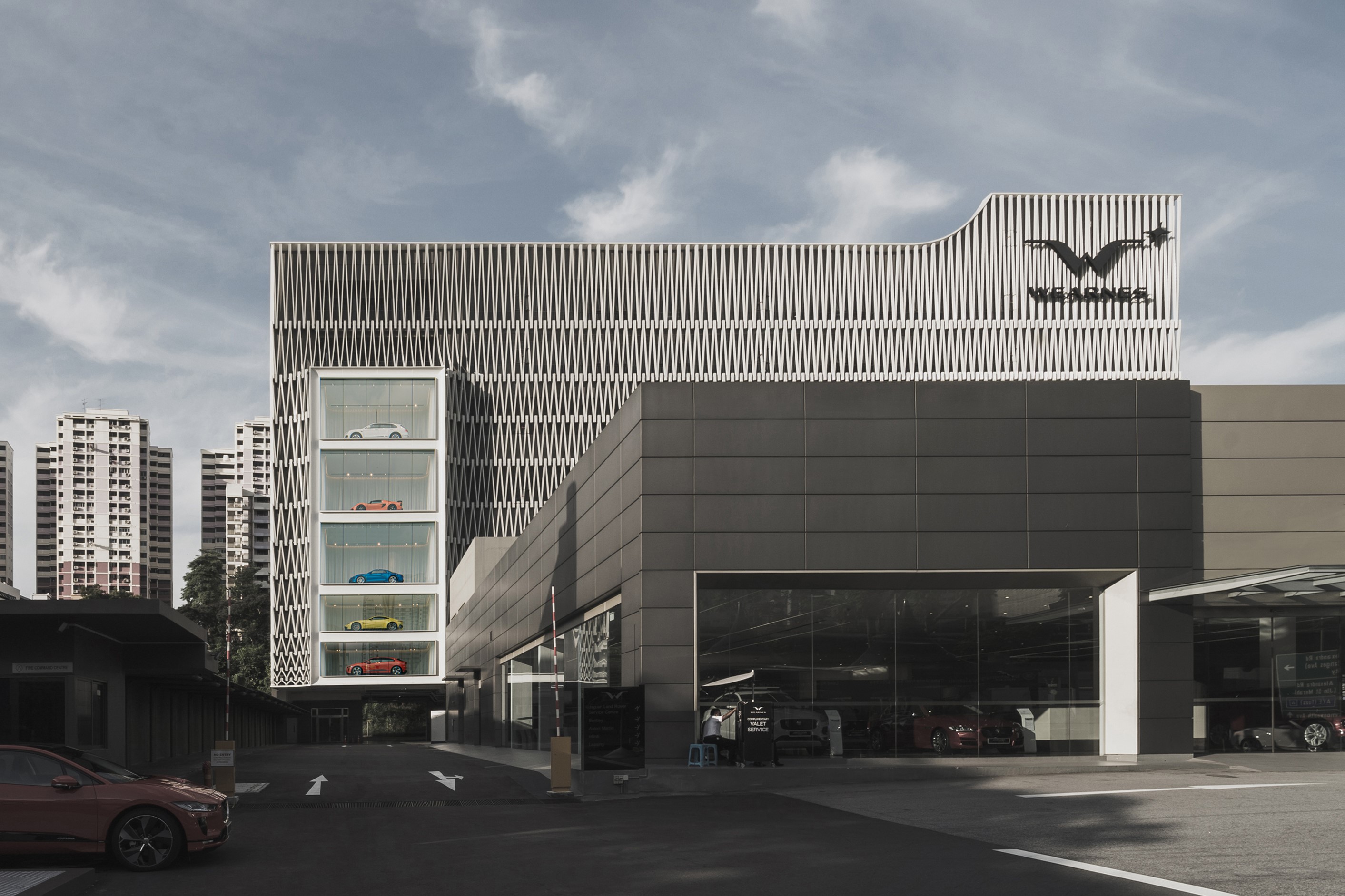
Nestled amongst the light industrial buildings housing automobile showrooms along Leng Kee Road, the nine storey Wearnes Automotive Headquarters co-authored by Team Design Architects and Pencil Office is set-back from the main road allowing the front showrooms to etch their brands visibly onto the identity of the streetscape, yet still commanding the urban composition with subtle confidence.
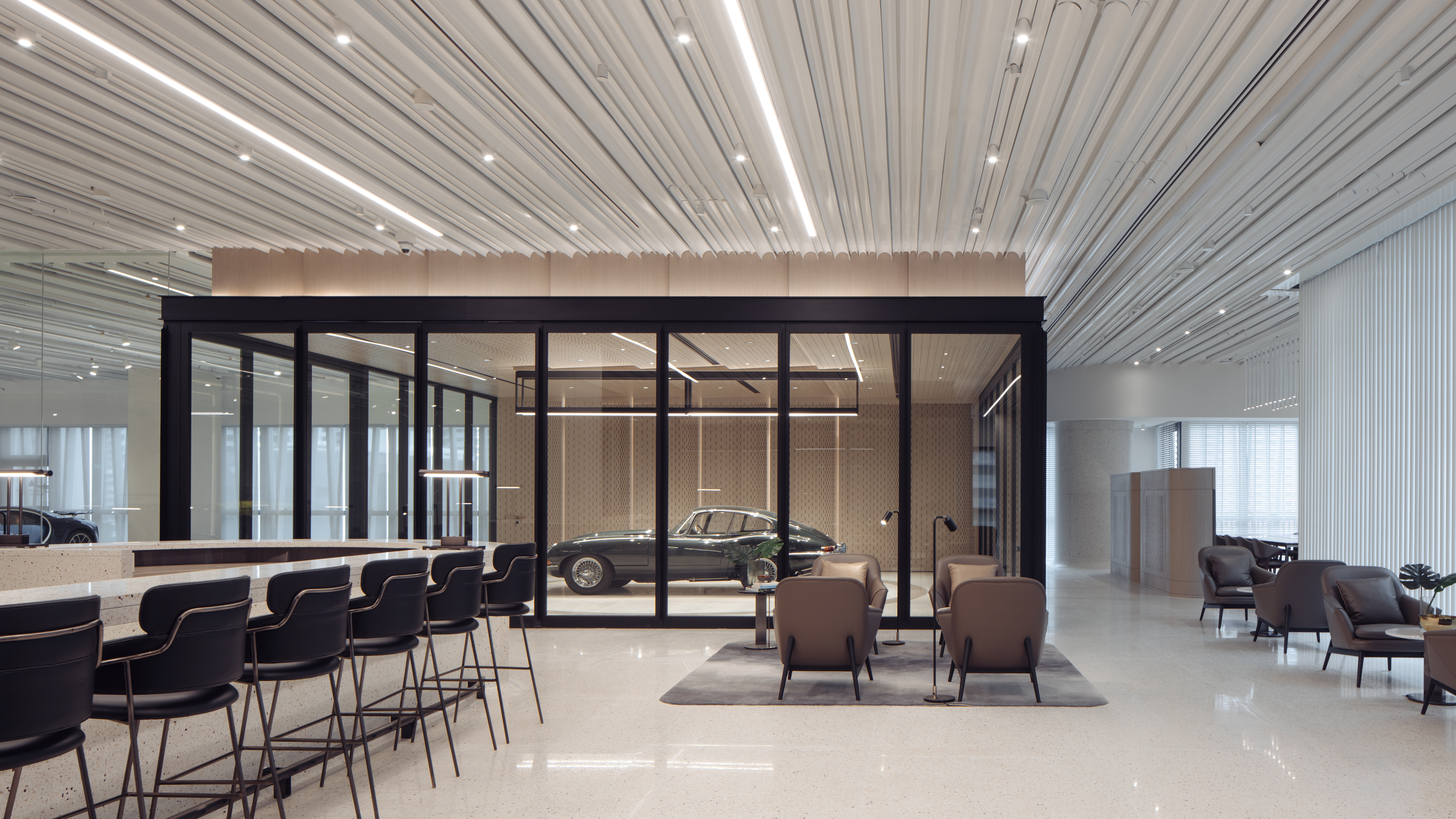
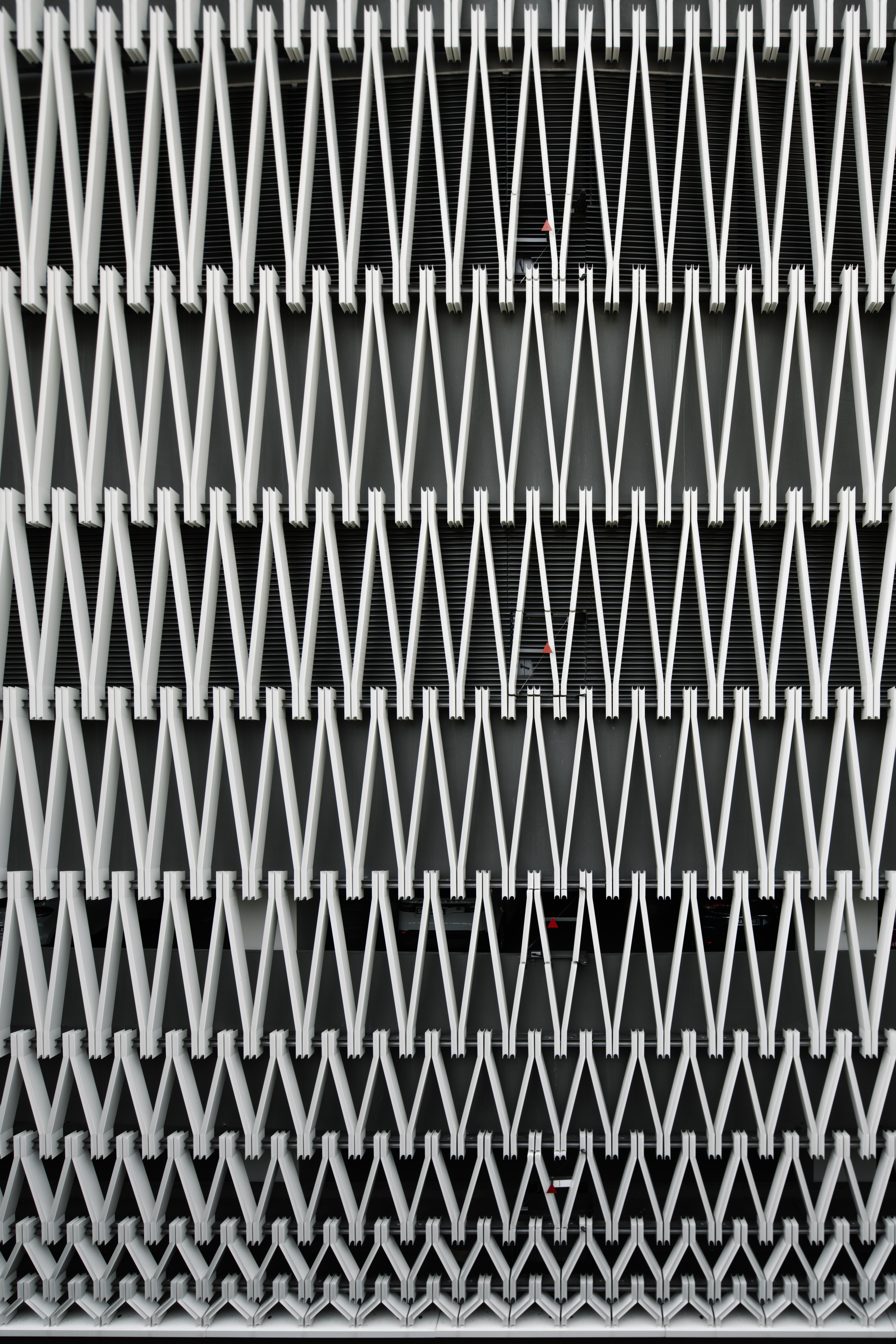
Seen from the afar, the façade is an arresting filigree of gentle aluminium tapers, bold in its graphic quality and dynamic as a field of repeated motifs. In a profession infatuated with heroic architecture, Wearnes offers a refreshing counterpoint: a high-performing background building well proportioned, scaled and articulated. Are the virtues of this project more than skin-deep? My visit revealed much more than meets the eye from the outside.
Tropical veils
Consistent with the body of work and disciplinary preoccupations of Pencil Office, the external veil is a quintessentially tropical response to the hot and humid equatorial city. Six of the nine floors are entirely naturally ventilated as the built mass is shielded from extreme solar heat gain by the intricate gradient of angled fins.
Each fin is a concave aluminium extrusion, precisely joined on a chamfered edge at is slopes laterally. The fluted nature of the extrusion aggregates to a delightful order of proportion, hierarchy and movement, ever changing as the envelope stretches across the different parts of the building like a fabric. Each move is deliberate and well calibrated to the relationship of the external veil to the corresponding internal spaces, creating meaningful zones of compression and relief on the façade.
Perhaps the most evidently heroic gesture is the 5-storey display frame for precious automobiles, greeting visitors as they approach the building. The external skin gently follows this protruding volume, formally integrating it into the composition while at the same time lending the entire system a delightful visual lightness.
The second veil is embedded within the internal architecture of the project, framing a three-story atrium culminating in a mesmerising oculus at the top. The atrium is the main touchpoint for clients, buyers, suppliers, employees and guests of the company. It is a social space punctuated by well-choreographed seating and finished in a refreshing palette of white, timber and subtle terrazzo.
Without doubt, the oculus atop and gestural staircase connecting the workplace floors are a tour de force in composition and control. The minimalist white tubes defining the porous lattice enveloping the atrium also gently taper at the base, bundling in groups of three – a simple yet effective articulation reminiscent of some of Minoru Yamasaki’s elegant structures.
The staircase draws the eye upwards as its flights and landings challenge gravity with the same elegant effortlessness that permeates the ethos of the entire project.
In the detail
I found myself pausing for a closer look at details very often throughout my visit.
Starting with the external veil, the semi-circular concave profile of its lattice members dramatically lightens up the composition. The thin vertical edges catch the light while the receding curved surface allows for a gradual penumbra wash. Architectural decisions are not only in the service of beauty, but also shrewd practical solutions to discharging the heavy monsoon rain during the wet season.
Internally, interfaces and tectonic articulations are resolved in a playful balance of well edited restraint, and exuberant moments of flair. The soft tactility of the skin wrapping the handrail of the atrium staircase – in an Aalto-esque fashion – is further enhanced by the care given to the manner each steps formally joins the vertical in a gentle fillet.
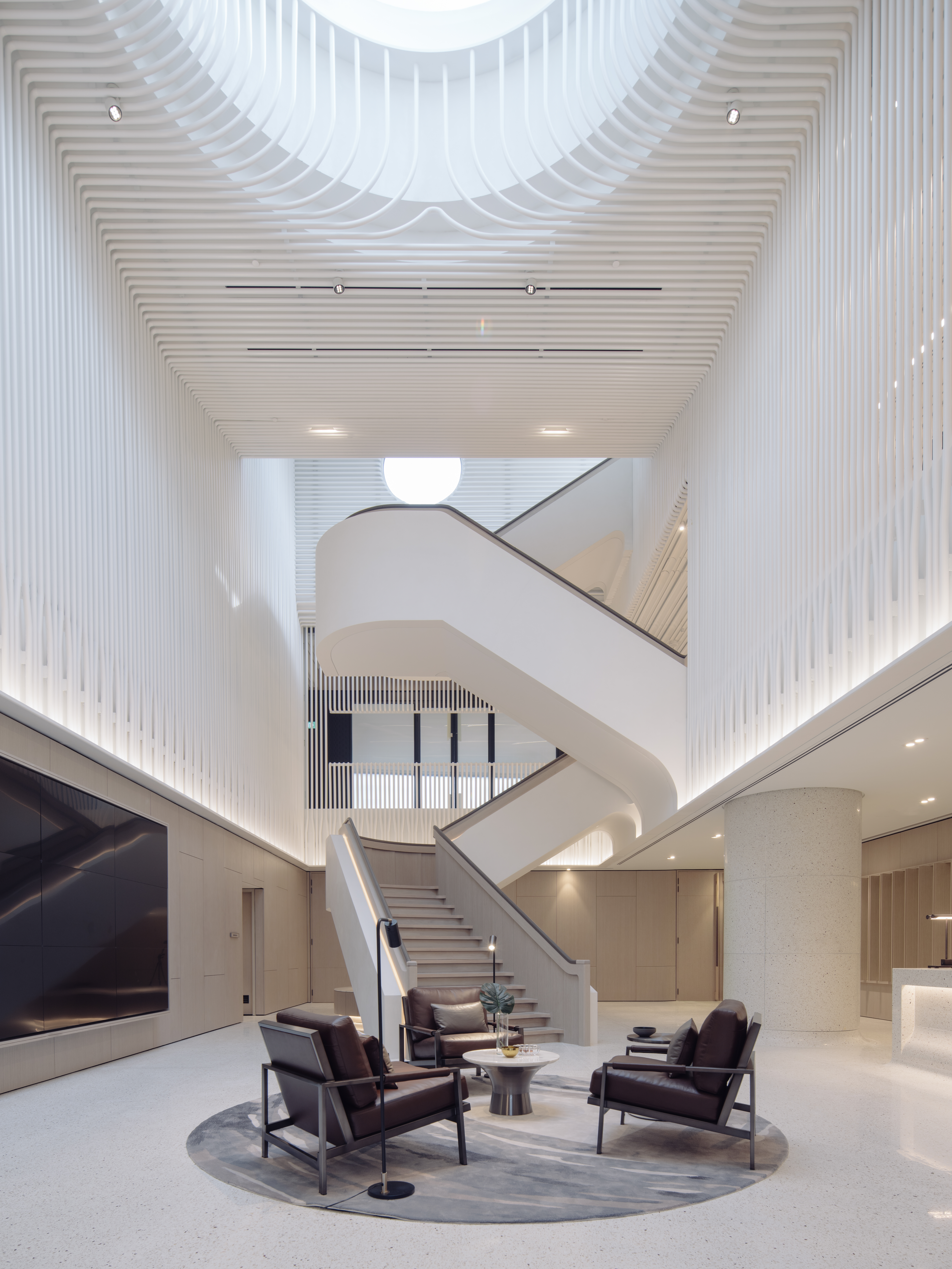

The columns and floor are seamlessly blended as well in terrazzo, making the gradual transition of the surface and light washing on it a profoundly rewarding visual experience. Within the workplace, door handles invite the touch with the same trademark filleted-edge aesthetic seen throughout the project.
One of my favourite details perhaps is the fin crowning the mullions of internal partitions. These elements add depth, rhythm and texture to everyday surfaces, almost like an homage to the tailfins of classic cars from the past.
Just like a perfectly designed automobile, each aesthetic solution stops comfortably short of being frivolous yet indulges in the delight that good generous design brings to the senses.
