An Inclusive Building: The Rainbow Centre Extension
Editor's Note:
As society evolves to become more inclusive, we are witnessing an era where architecture can play a greater role in creating safe and enabling environments without stigma to support persons with special needs. This humane conception architecture is not new, recalling the legacy of humanistic Dutch modernists like Herman Hertzberger and Aldo van Eyck. In this feature, we examine the groundbreaking Rainbow Centre Extension by Plystudio Architects and the Architects Circle.
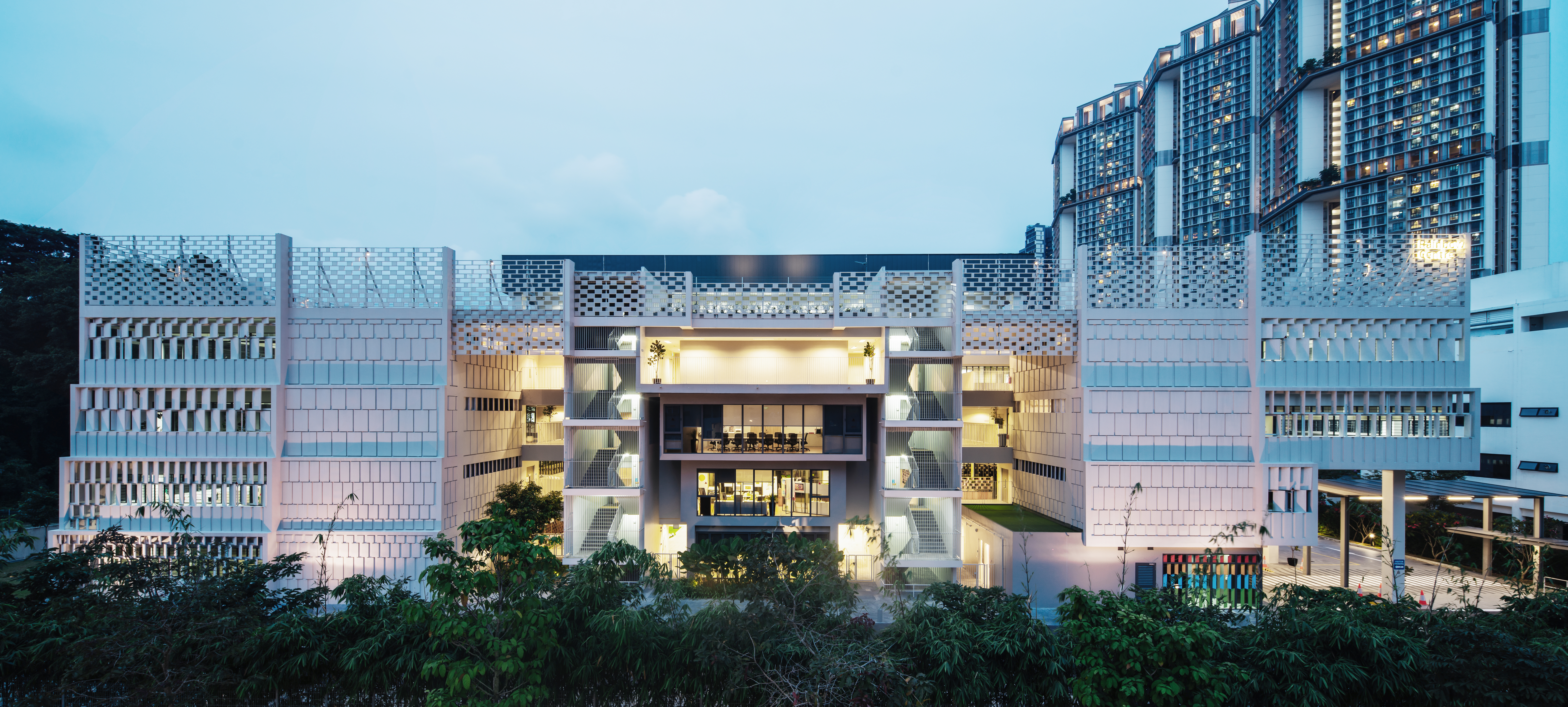
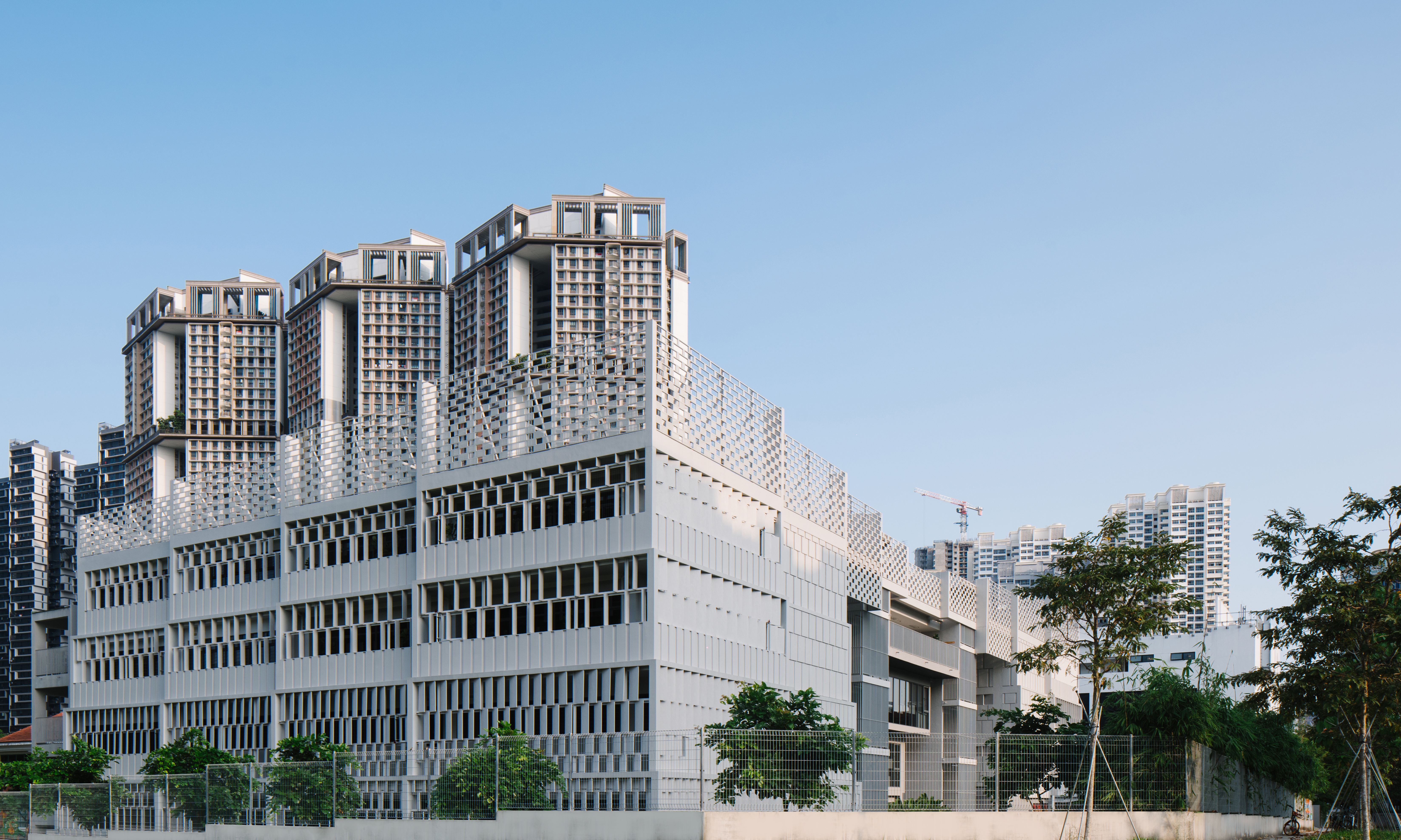
Over the years, my experience of any architecture with design ambition inevitably converges on one of two possibilities - the first, where savvy photography embodies the design vision better than the actual building, or the second, where the architecture as "experienced-in-the-flesh" exceeds any image depiction. My first gut instinct on visiting the new annex to the Rainbow Centre - and experiencing the range and resolution of its form and presence - is that this building belongs to the latter category. Here is a modest 4-storey annex building whose formal, spatial and programmatic complexities defy simplistic reduction, including by photography. This is a nuanced, highly-customised architecture that befits its deserving users.
The Rainbow Centre is a not-for-profit organization that seeks to empower persons with disabilities such that they can thrive in inclusive communities. It traces its roots to the original Margaret Drive Special School set up in 1987 for children with special needs. Today, the Rainbow Centre's mission extends far beyond its original narrow mandate of Special Education to include training, therapy, and other holistic interventions for children, youth and young adults with disabilities, helping them to integrate and thrive in society-at-large. To realise these noble goals, the centre's physical premises have to be a safe space that offers a microcosm of society - at once enabling and supportive.
This holistic premise frames the design brief for Plystudio Architects and their project-delivery partner The Architects Circle. Ar. Victor Lee of Plystudio Architects explains the brief's complexity, "From the very beginning, we realized that it is not just a school. The programme has multiple components we have to deal with. How do we create shared spaces such that these components are well-integrated, exist within one building, and have their own function to play within the inclusive community? Also, how do we house them in distinctive parts of the building so that it supports their workflow? The programmes are actually quite intricate."
For Plystudio, the challenge was to provide a legible and coherent framework for the range of education, training, corporate, social, and other ancillary spaces to cling onto and co-exist symbiotically. The architects indirectly found their answer in the typology of the existing school building. The pre-existing Rainbow Centre - a typical school building with many typological brethren - had a generous central courtyard with classroom-flanked corridors that conveyed a repetitive, institutional feel. For the architects, the light-filled courtyard was an important wayfinding device and an anchor space for social congregation. Nevertheless, the old classroom corridors were insular and cold, if efficient.
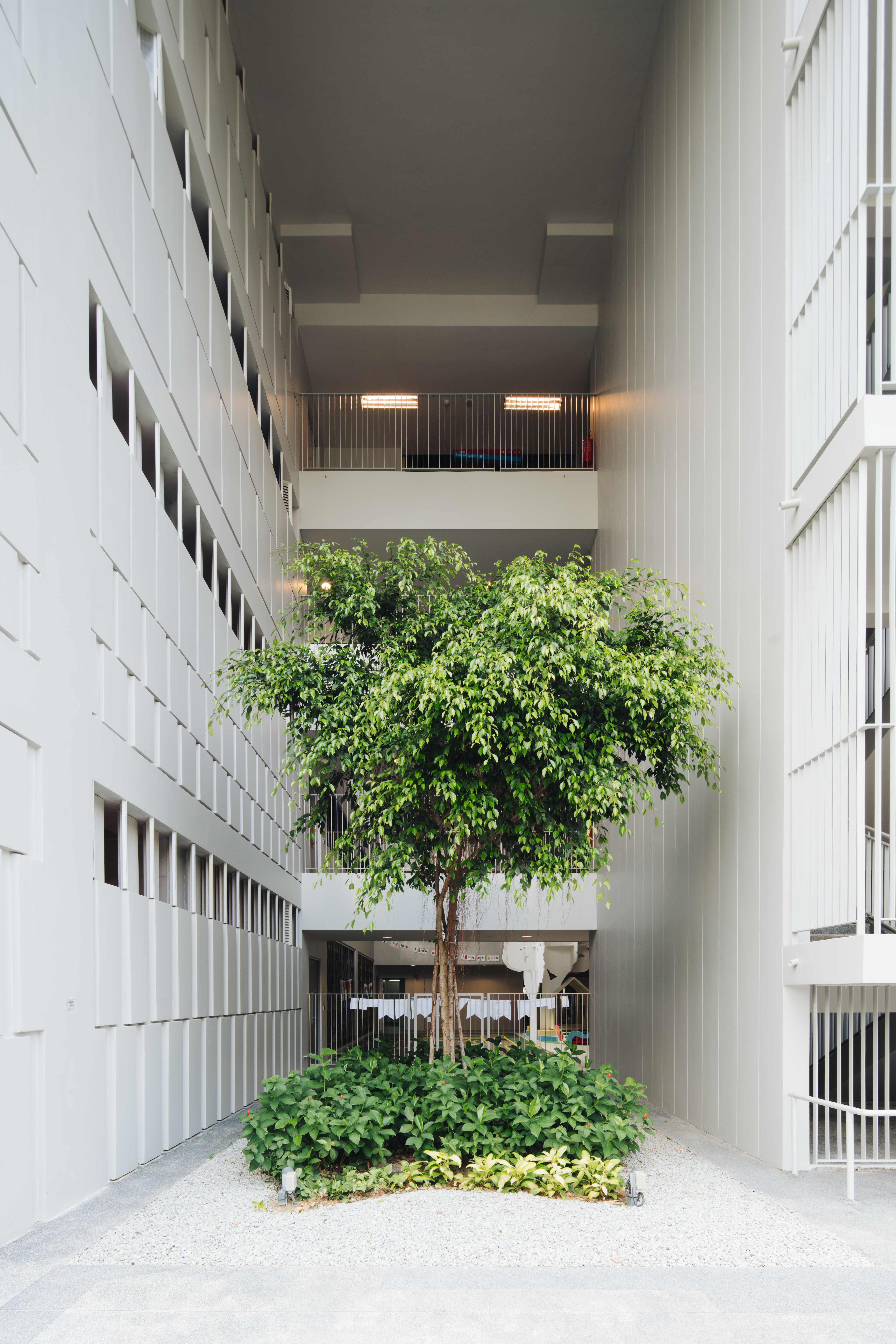
The question was how to innovate on this type to lend greater spatial variety and social richness, while improving its flexibility and retaining its legibility. Within the constraints of a modest 4-storey addition on a narrow site, the architects decided to re-conceptualise the courtyard as two volumetric, light-filled atriums to anchor the new building. Each atrium has its unique sectional (and terraced) profile that is finely calibrated for human-scaled interaction and intimacy. Other programmed spaces like classrooms, art studios, offices then coalesce around these anchor atriums on a plan layout that roughly resembles an "8-shaped" donut.
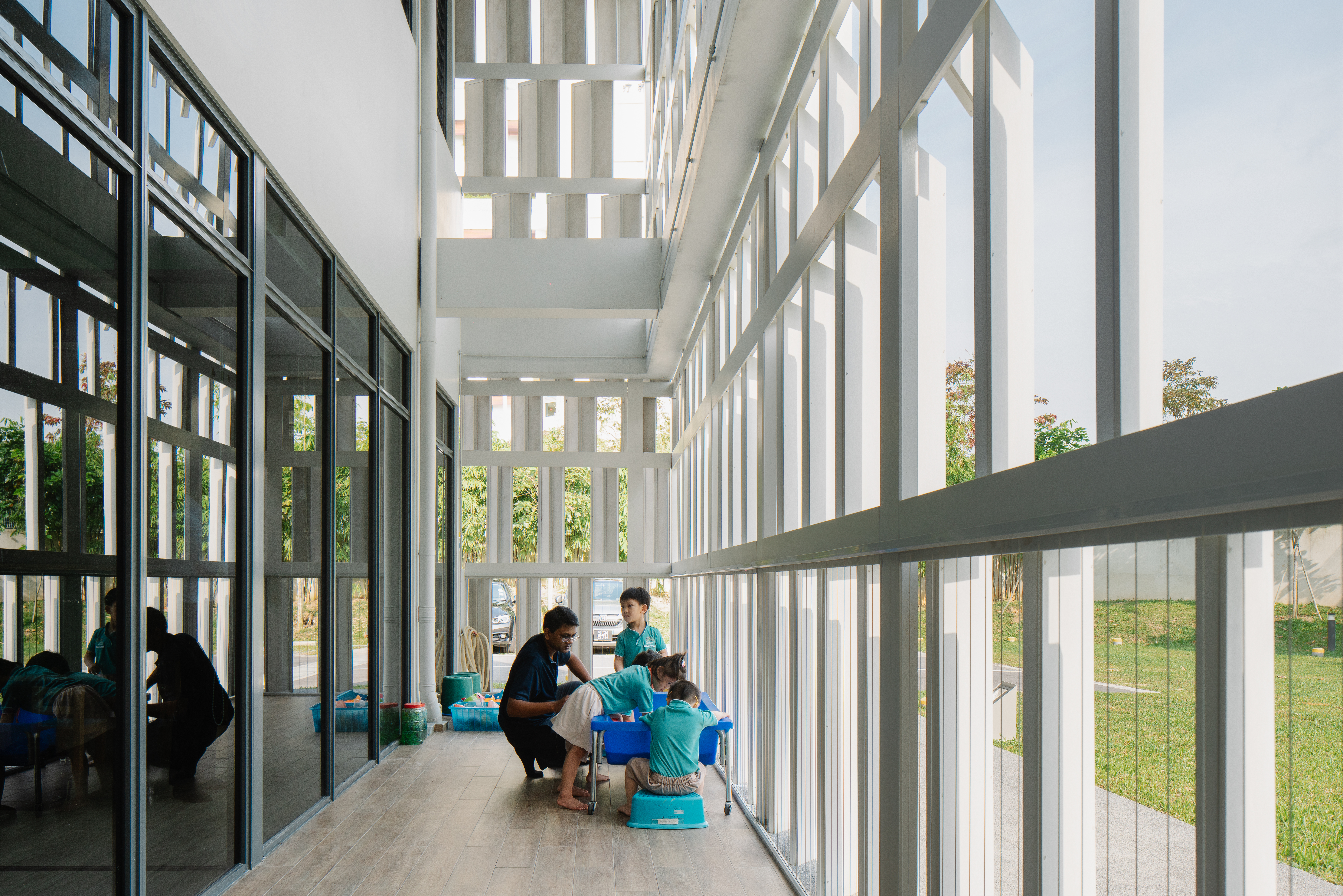
Traversing these light-filled spaces, I cannot help but be inspired by how the building hums with life at every corner. Parents linger at the ground floor cafeteria watching over their wards, social service professionals exchange quick chats in delightful bump spaces, students' artistic creations cover the walls - a gentle humanism infuses this building. This flourishing microcosm-of-a-society demonstrates in real life the intricate relationship between physical architecture, its touchpoints and interfaces, and the resultant social life. It follows on the humanistic legacy of Herman Hertzberger, the Dutch architect who designed his architecture fir the social life of its users in projects like his Centraal Beheer complex.

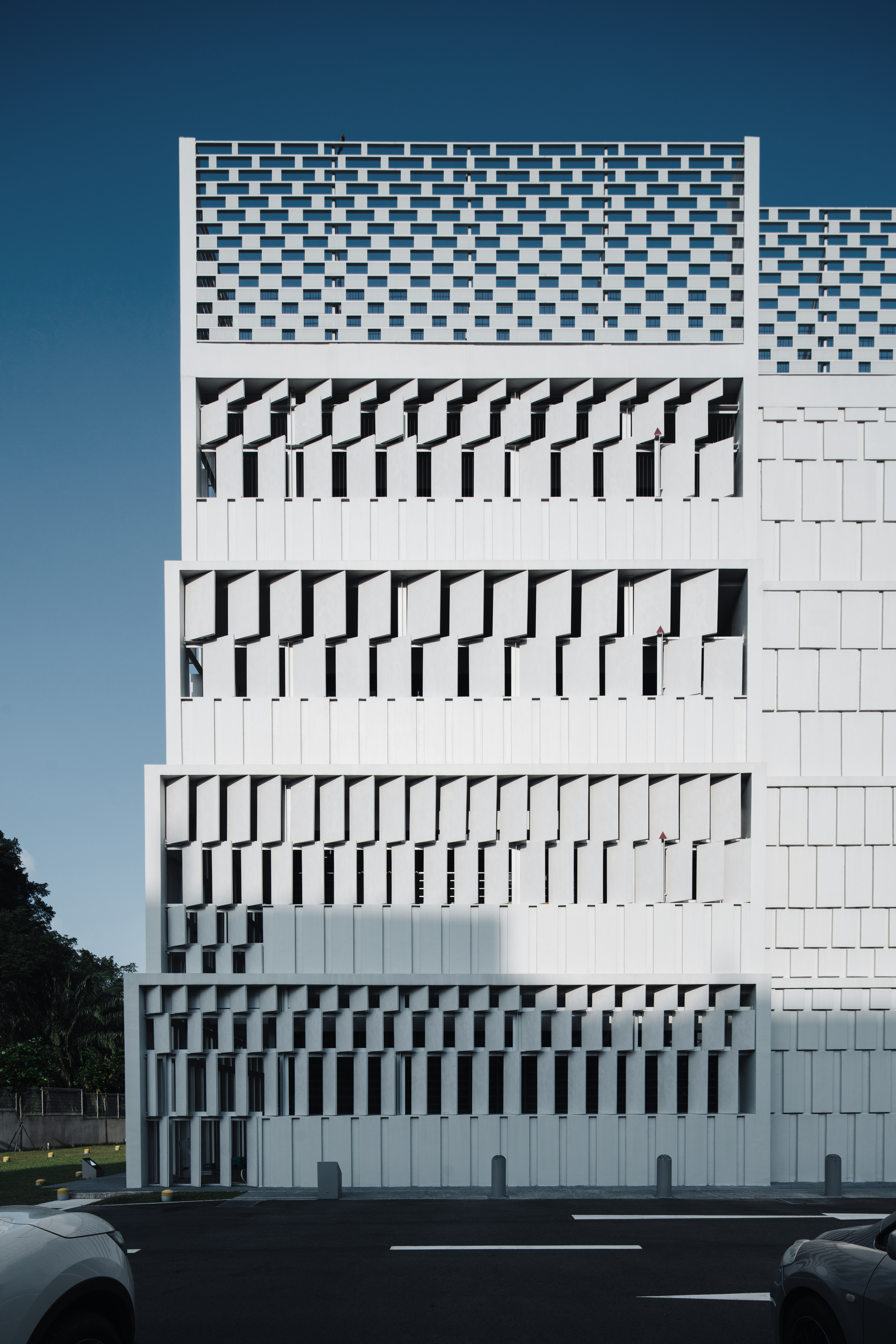
Over and above typological configuration and programme, good architecture inevitably requires another level of visual resolution that relies as much on the architects' aesthetic choices than on mere solution-based competence. The Rainbow Centre Extension over-delivers in this department as well. A visual and formal choreography pervades this building, arising from subtle repetition and modulation across multiple scales - of structural bays, of floor slabs, of masonry units, of sun-breaker panels, among other building elements. This continuous shifting and stepping in equivalent ratios - but finely calibrated - creates a musical effect akin to a Bach choral cantata where a single theme repeated across different registers and groupings crescendos into a polyphonic chorus. Harmony ensues.
I am in thrall of the visual texture and range enabled by a single repeated move. Take, for example, the building façade's modular rhythm that encompasses the full range from solid to void, and heavy to light. Modular pre-cast masonry blocks transition gradually to planar tectonic louvers and then culminate in light metal screens on the roof in a seamless visual rhythm on alternating modules. Additionally, subtle tonal differences of grey paint further articulate the volumetric reading of surfaces. This yields a façade that becomes a veil with varying degrees of enclosure , creating a goldilocks dance that is neither too enclosed nor too open, neither too heavy nor too light, but suspended in perfect tension.
Every imaginative detail in this building acknowledges the unspoken rules of reality and economy - from the light, floaty metal screens at stair landings that creatively interpret BCA handrail regulations to create a volumetric effect, to the precise setting-out of prosaic T5 light fixtures. Here is proof that even the most everyday, run-of-the-mill ingredients can be corralled to imaginative effect, creating an architecture that exerts a "Net Positive" for our commons and sense of greater good. Hats off to Plystudio Architects for pulling off this stunner - on a tight budget and a 2-person design team, no less.
