SMU CONNEXION: A NEW LEARNING FRAMEWORK
Over the years, Singapore has always paid special attention to refining the notion of “school”, both as an idea of place and also as a form of practice for education and development. As the university evolves in response to the manifold challenges of today – pedagogical shifts, pandemics, global economies, socio-political sensitivities, climate change, and resource scarcity – architects are tasked to redefine and reimagine the appropriate learning processes and environments to support this unfolding brief.
Opened in January 2020, SMU Connexion by MKPL Architects demonstrates a strong commitment to the University’s SMU-X pedagogy, which emphasizes experiential learning through real-world engagement. By successfully creating a flexible, smart, and adaptable environment for cultivating innovation and entrepreneurship, the work also represents a comprehensive response to the opportunities and constraints of the university’s city campus location, and of the complexities of building technologies and various authority requirements.
SITING OPPORTUNITIES
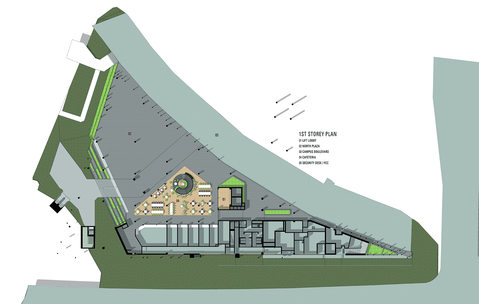
Sandwiched between the Fort Canning Tunnel entry and SMU School of Accountancy, SMU Connexion sits on a triangular wedge of land backed up against the pedestrian link to Fort Canning Park. To add further difficulty, this plot was a partial remnant of the Old National Library, which required heightened design sensitivity around artefacts such as the front gate and fence. Underground, the old Stamford Canal ran through the site; at ground level, it was impossible to locate a new electrical sub-station due to site restrictions.
Given such extreme limitations, the architects deserve a hearty round of congratulations for successfully steering SMU Connexion through to completion, in coordination with the consultants, and with full engagement with local authorities and agencies. In such a project, the qualified practitioner is tasked with the twin competencies of a full-service provider and a visionary designer; MKPL performs both roles with admirable aplomb.
BLURRING TYPOLOGY
A little over a decade ago, Silicon Valley companies revolutionized the nature of work by adapting the pioneering grassroots qualities of industrial warehouses, home garages, and college spaces to spark creativity and embed learning environments in their tech ‘campuses’. We have come full circle; academic spaces today reciprocally reference the principles and design language of innovative, collaborative workplaces to augment the educational experience.
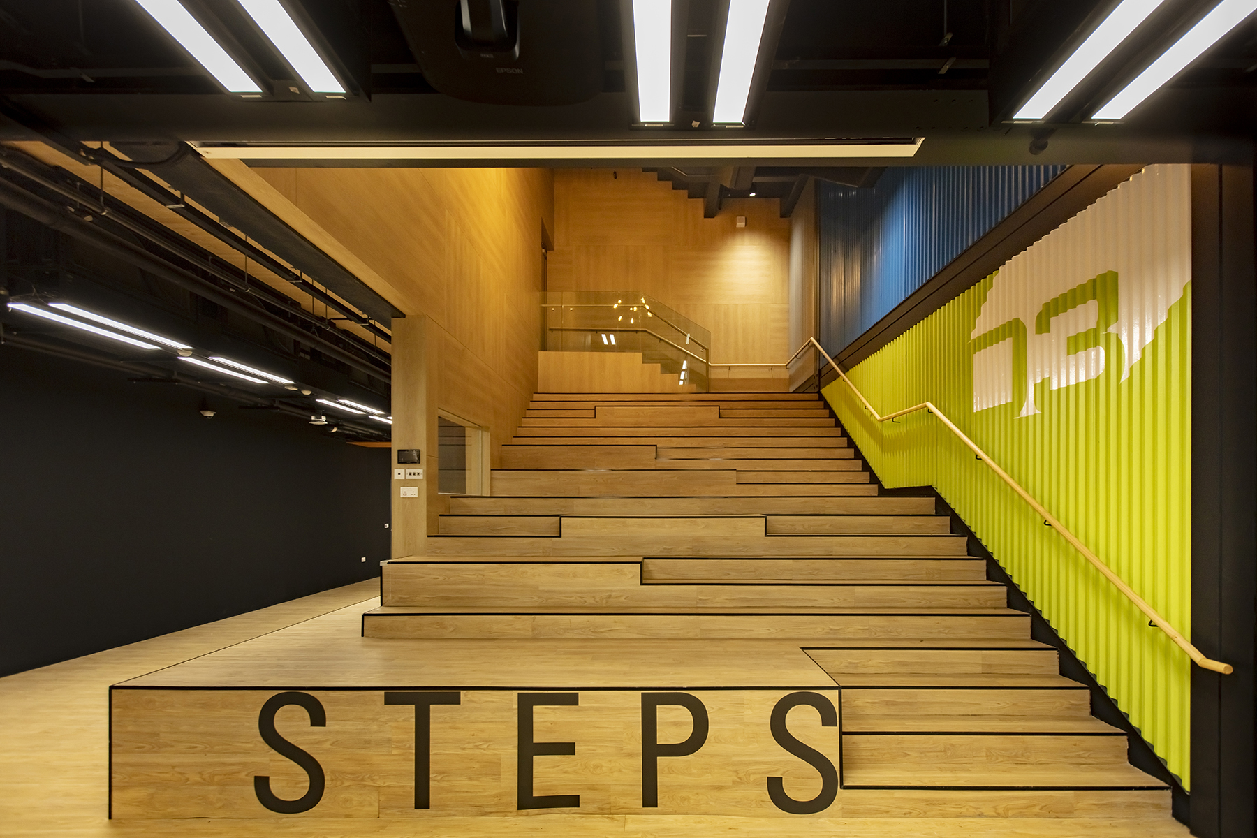
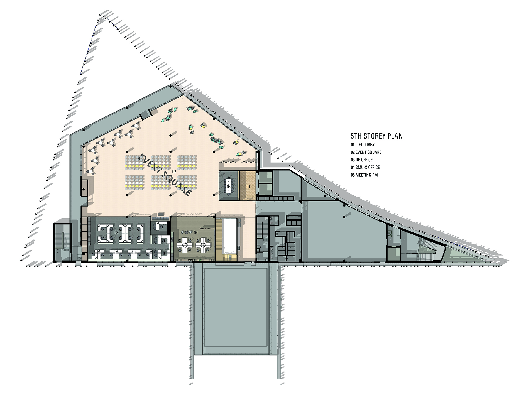
It is clear both client and architect prioritized the need for learning flexibility and choice at SMU Connexion. The building mass is best understood as a series of reconfigurable floor plates that are stacked, offset, and connected by a range of vertical circulation options. The “Active Learning Classrooms” were designed to accommodate various learning setups within a framework of operable wall partitions, mobile furniture, and integrated technology such as floor power distribution. The rest of the building is similarly conceived with multi-purpose use in mind; for example, the “Steps” - a multi-storey space consisting of stairs that blend into auditorium seating - is a hybrid of circulation, vertical theatre, and an internal agora.
There is a plethora of general student access and bookable options available for how one may choose to learn, study solo, or work together. The open concept “Collaboration Zones” would not be out of place in the Silicon Valley office, with the diversity of seating defined by colourful carpet islands and planters, semi-private booths in playful shapes, half-height acoustic partitions flanked by fully enclosed “meeting pods”, or conference rooms. Material choices reinforce this impression, with the use of exposed timber, steel, and ceiling systems, as well as interior finishes such as corrugated metal wall panels.
In abandoning the old paradigm and hierarchical order of the lecture hall and classroom, with their linear rows, columns, fluorescent lighting, and safe neutrals, how do designers avoid the pitfalls of edgy aesthetics for its own sake? SMU Connexion presents a satisfying counterpoint to such concerns, as the project team and stakeholders embarked on a rigorous beta-testing process with full classroom mock-ups involving end users. This allowed the architects to refine the learning environment to best support the innovation process; the campus building has become a platform, sandbox, and creative tool, enabling students to take risks in a safe space.
Sociologist Ray Oldenburg first introduced the concept of the “third place” in 1989 – a public, social space to complement one’s first place (home) and second place (work). In recent years, companies have discovered the value of third places in the office – informal spots for collaboration, social activity and relaxed individual work, as such places promote company innovation and overall employee well-being.
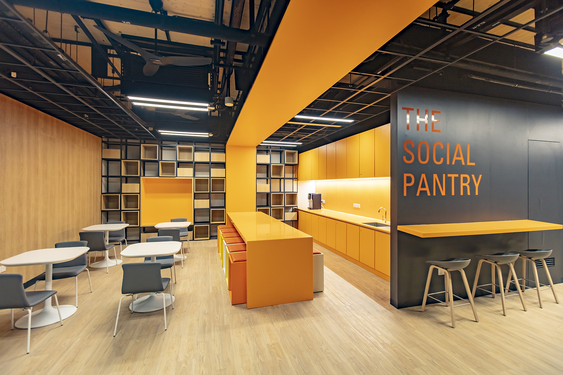
Along this line of thought, SMU Connexion is a case study in third places within an academic setting. The “Social Pantry”, for example, is a multi-purpose area: an amenity space that encourages student interaction, accidental knowledge transfer, and learning outside of structured class periods. Every square foot of the building has been scrutinized for its potential for cross-disciplinary, informal collaborative learning: corridors have been widened to become extensions of the classroom; stairs have turned into seating; and walls are doubling as writing surfaces or for digital display.
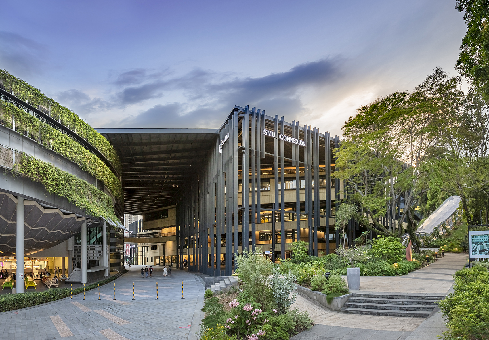
The project has also considered the third place in relation to the city: by incorporating multipurpose program that the public may access, such as the ground floor café, covered events plaza, and assorted linkways, the campus building invites community engagement and interaction with the arts and cultural district.

ORDER & FLEXIBILITY
The theme of “order” raises interesting points of discussion in relation to SMU Connexion: firstly, that its road to conception was extensively managed and pre-planned. The building was designed and coordinated with BIM technology, and constructed within an expedited schedule made possible by careful prefabrication sequencing and assembly of all building components – in particular, the double-storey link bridge spanning across the Fort Canning Tunnel entry was erected in five days. Beyond completion, smart building management systems have also afforded a degree of control for the automated regulation of interior environmental comfort levels.
More significantly, “order” implies a framework. In the 1960s, Archigram’s radical Plug-In City – movingly rendered in pop art aesthetics of the comic book – had explored how a prefabricated, modular toolkit would enable bottom-up development of an emergent, three-dimensional urban system. Sixty years on, SMU Connexion may be seen as a prototype manifesting these ideas, with its distinctive language of repeatable, prefabricated components, and with interiors awash in vibrant, primary colour swatches. Because of its triangular site and its multiple angles of approach, the building lacks a distinct front elevation – rather, visitors perceive a dark steel frame that is the structural logic and its brise soleil pattern, within which yellow timber volumes insert, stack, and cantilever themselves. It suggests an informal scaffold-and-infill logic that is a snapshot in time; we could believe that its next phase of growth would be just around the corner.
SMU Connexion takes a strong position in claiming a form of architecture with agency – it references design vocabulary from other generative typologies to put a new face to learning, and to provide responsive order to the evolving needs of education. Within a larger context, it stands as a stirring reminder that architects must explore how our practice may move beyond service provision, and seek ambitious outcomes that incubate new forms of intellectual and cultural capital.
