Citi Wealth Hub
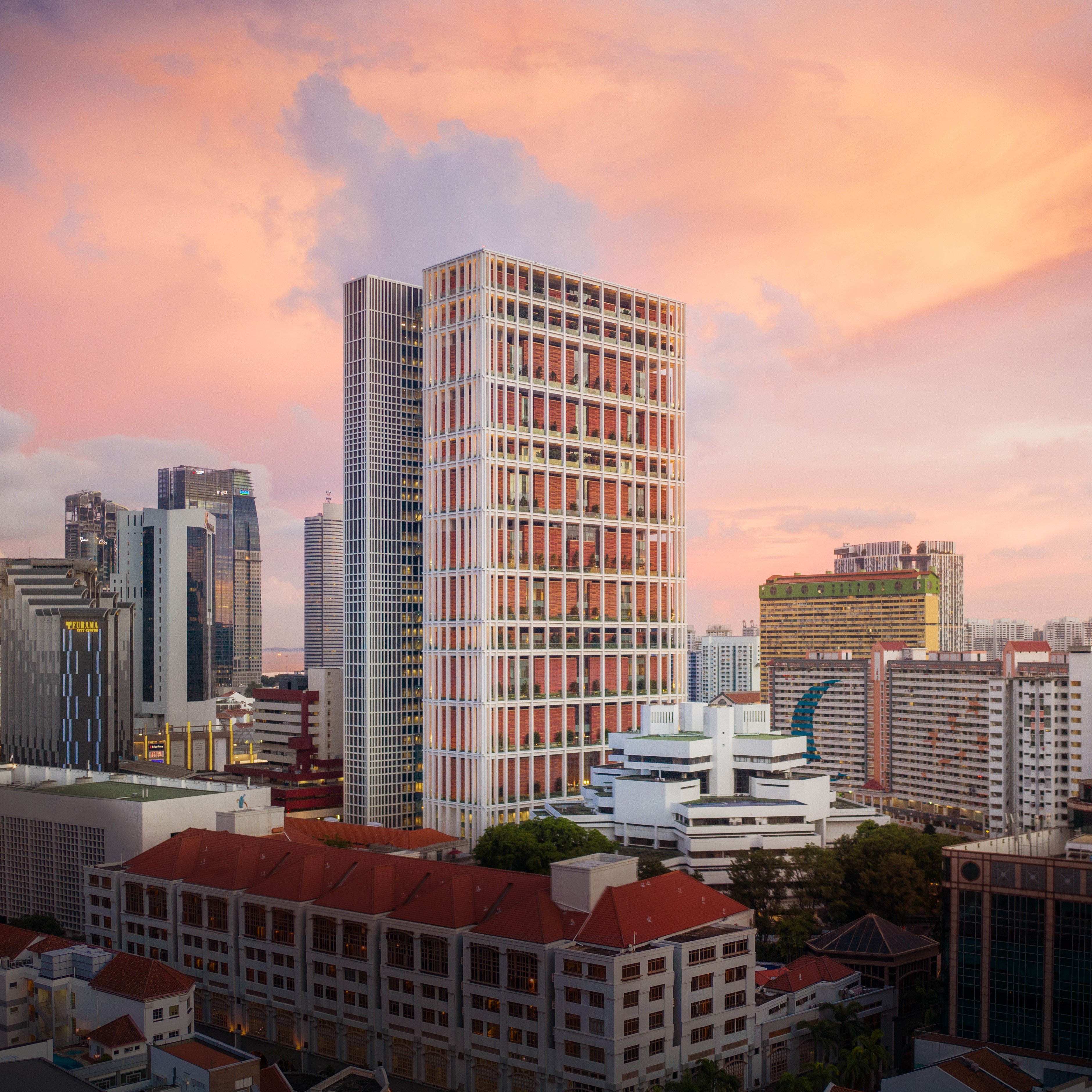
Back in 2014, a new design by Ar. Raymond Woo replaced the previous Yen San building at 268 Orchard Road. Unlike its predecessor and many of its neighbours competing for a slice of vertical real estate along Singapore’s premier retail strip, this time 268 Orchard did something entirely new, if not counterintuitive at the time. The crystalline stack of gently filleted glass cubes stepped away from the main road, in a gesture reminiscent of Hugh Ferriss’ 1916 New York City, shading less its immediate public realm, and giving itself sufficient visual relief and exposure to daylight.
2021 marks Citibabank’s homecoming back to 268 Orchard, where it used to have a branch between 1988 and 2005. In a year shaken by a pandemic and in a new building entirely different from its predecessor, the context, opportunities and challenges for the new Citi Wealth Hub have been nothing short of unprecedented. How has Ministry of Design delivered on this complex task? My visit revealed an immersive experience that photos don’t do justice to.
Transparency: literal and phenomenal
In a paraphrasing of Colin Rowe and Robert Slutzky’s eponymous essay published in Vol 8 of 1963’s Perspecta, transparency is both a physical material state of permeability to light and air, as well as a deeper legibility beyond optical characteristics. A simultaneous compositional perception of multiple forms in a perfectly choreographed spatial order.
Every step of my journey through the Citi Wealth Hub Level 7 Garden Lounge revealed a well calibrated and intensely scenogaphic approach to the rituals of function and how one experiences the space visually. Unencumbered lines of sight are masterfully balanced with gentle areas of occlusion meant to build anticipation and also offer the much needed visual and aural privacy to the financial operations of the Hub.
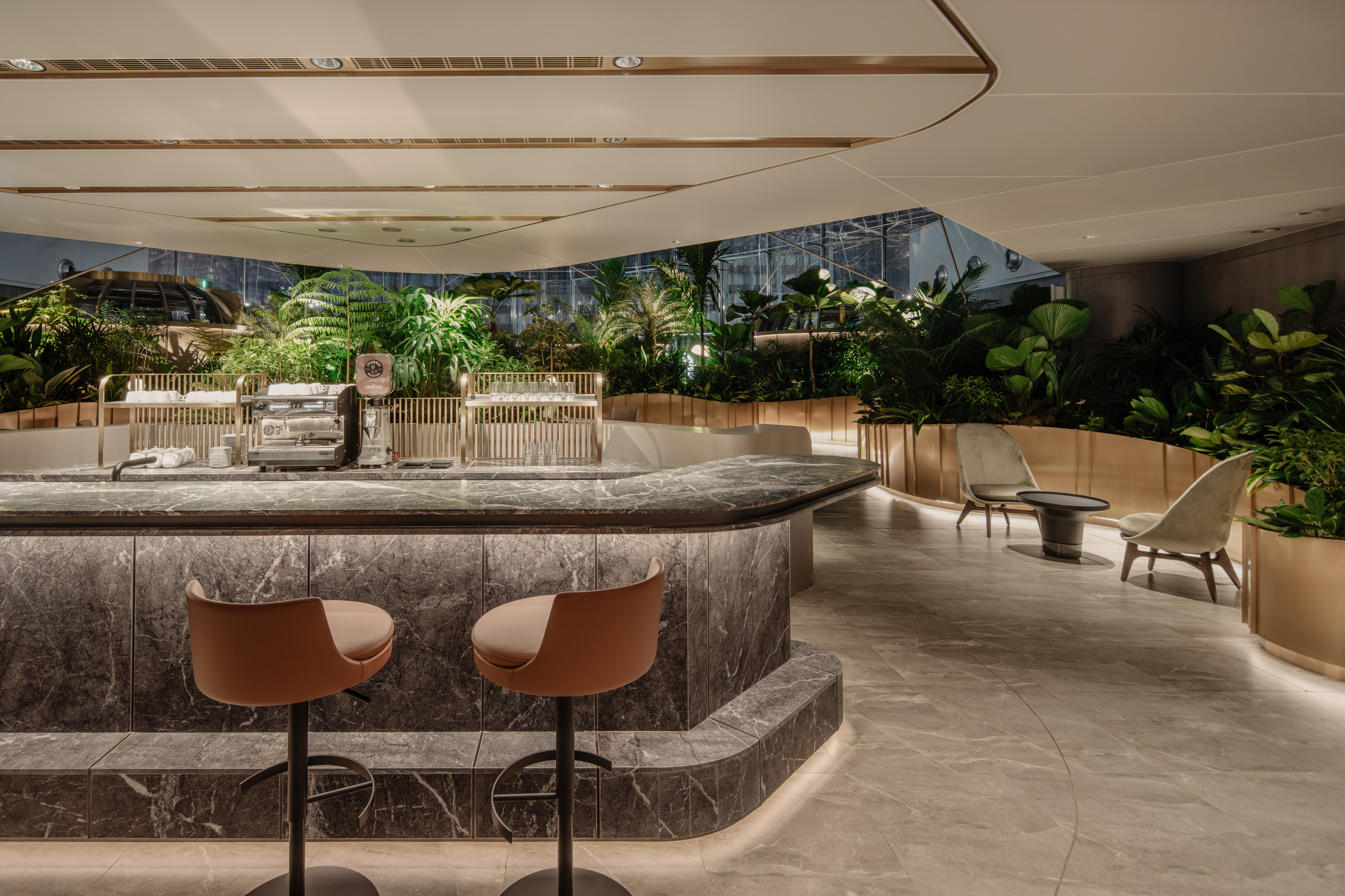
The fluid compositional lines, from the arrival at the lift reception area, through the social welcome of the Feature Bar and the naturalistic pockets of landscape ebb and flow in an effortless balance, reinforced by a well edited material palette. Like Alice through the looking glass, I was suddenly transported to a world made possible exclusively by design.
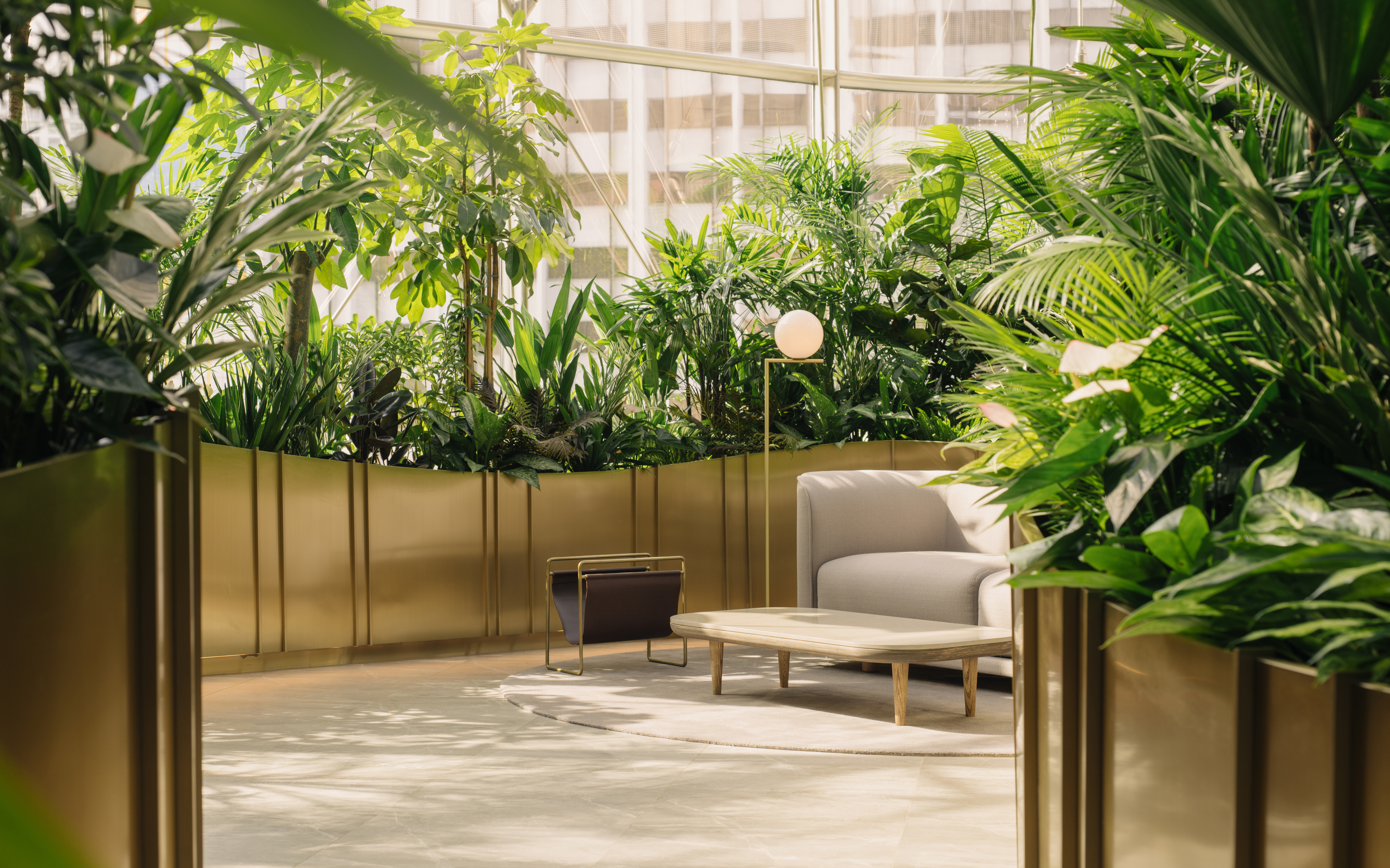
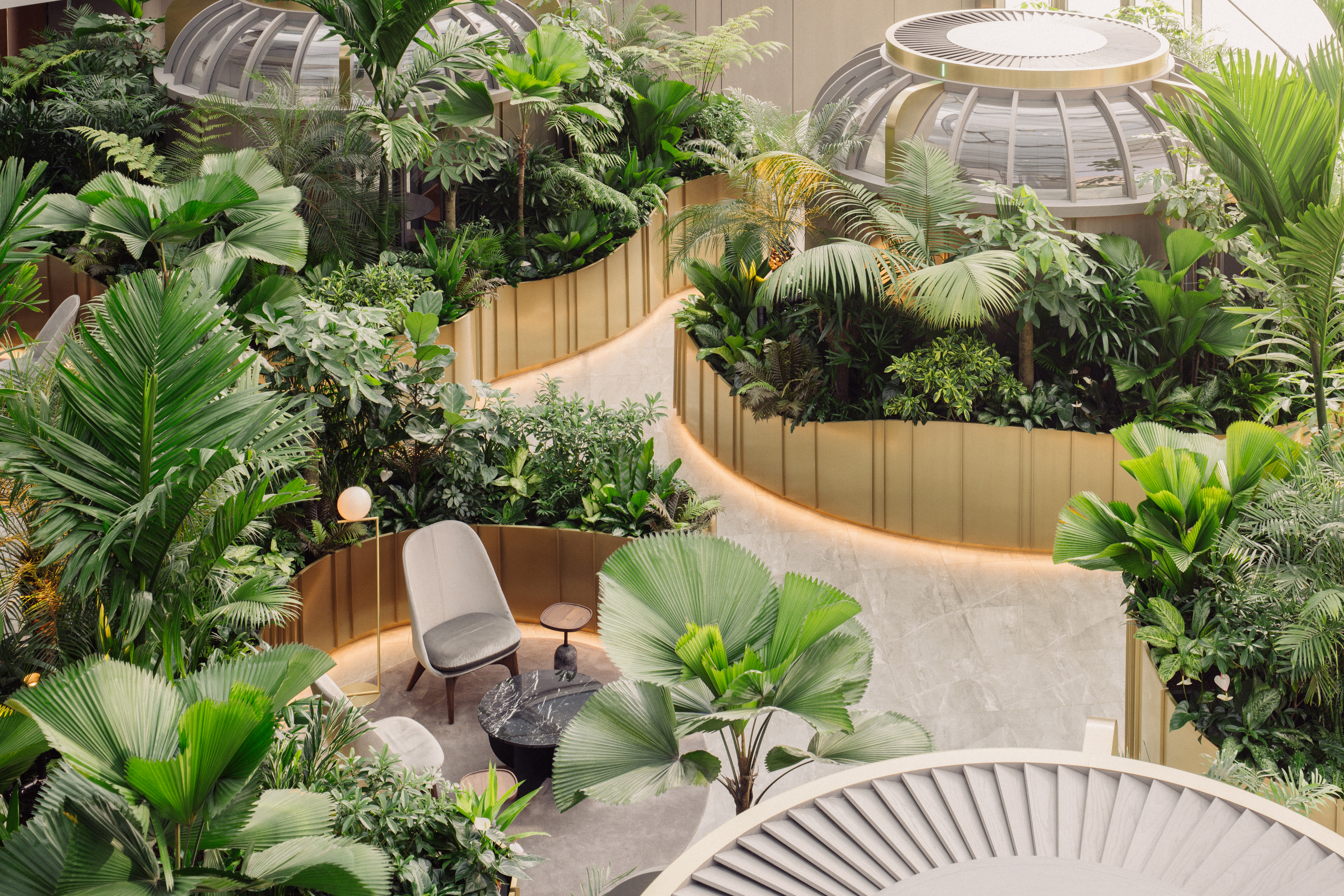
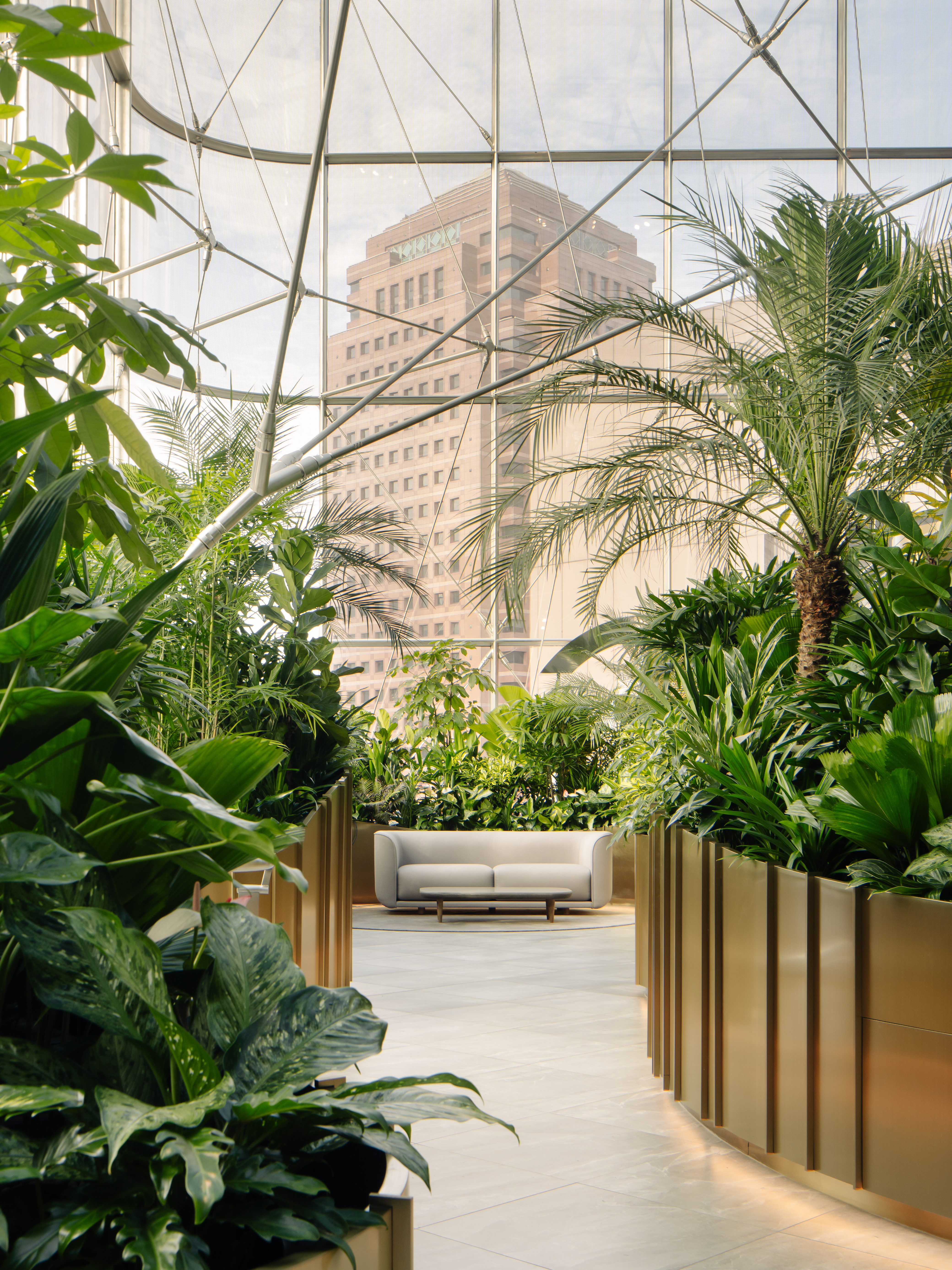
Taking full advantage of the expansive glass envelope and daylight streaming into the space, Ministry of Design created a “Banking Conservatory” within. Curated in collaboration with ICN Design, the garden and its modern-day follies – Lounge Niches and Garden Pods – are a playful spatial figure-ground both in plan but also from every other angle. By taking most of the workplace physically out of its traditional setting and giving it open light-filled garden spaces, the culture of the banking institution is further manifested as a metaphorical transparency worth noting.
Walking around the space I also noticed how the AC jet nozzle diffusers mounted on the Level 8 fascia were delivering air perfectly at the level of the Level 7 tree canopies, bringing them to life in an uncanny resemblance to an outdoors breeze. Whether by design or purely accidental, this effect further enhanced the notion of the baking conservatory as an authentically biophilic space, with visual, experiential and conceptual transparency between indoors and outdoors entirely aligned and clearly established.

In detail
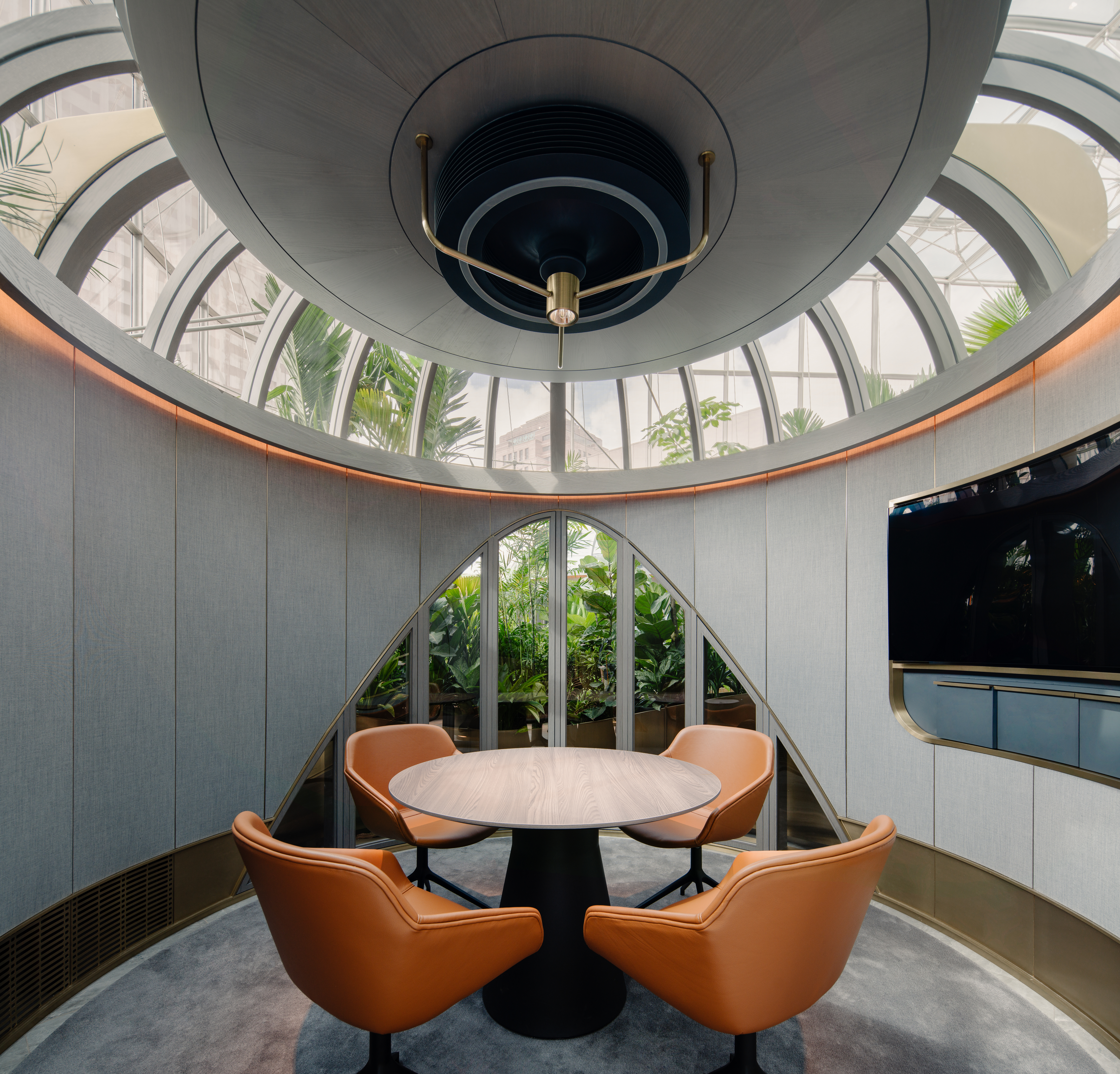
The most striking features are the Garden Pods, whose conceptualisation and execution shows a deep commitment to quality in design resolution. Nestled amongst the lushly planted gardens on Level 7, the circular pods of about 4m in diameter and 3.2m height provide a great balance of privacy and visual connectivity to their surroundings. Acoustic fabric finishes balanced with timber laminates, glazed panels and metal accents achieve a very comfortable visual and aural environment inside the space whilst making a reasonably small enclosure feel luxurious and spacious.
The lush planting surrounding the pods is intensely layered with the intent of creating a genuine botanical experience through hue, scale and texture. The plant species are resilient in indoor environments and variable levels of light and shade, grown using a hygienic hydroponic base. Wrapped in a hairline brass ribbon gently floating above a lit brushed-metal skirting, the garden gradually opens up to reveal Lounge Niches inhabited by contemporary loose furniture pieces inviting the guests to have a seat and enjoy a relaxed conversation.
As I made my way up through the various zones of the Citi Wealth Hub, from the Level 6 and 9 Staff Offices, to the Level 7 Citigold Centre and Level 8 Citigold Private Client Centre, I realised that although the different spaces are meant for entirely different activities and perhaps command a very different level of detailing and materiality, there are several key recurring hues and details that bind the project together through design as one cohesive brand.
Vertical rhythms – whether through accents on planter edges, elegant fluting on concierge desks and even the tactile ribbing of cabinetry - are in perfect balance with the cool-warm palette of grey stone, warm timber and rich brass. Together with discrete accent lighting and ever-present lush greens, the project exudes a spatial and chromatic warmth throughout all four levels, inviting discovery at all scales.
A place you want to be
As many organisations and cities around the planet are still figuring out how – and most importantly where – our work lives are going to unfold, it looks increasingly likely that magnetic workplaces are no longer places where you have to be, but spaces you will want to be in.
The Citi Wealth Hub is one of those places, blending a curated hospitality experience no doubt well informed by MOD’s expertise in the sector with a very clear stance on what makes work places attractive. In that respect, the Citi Wealth Hub is a tale of two halves, where front of house – spaces catering to client interactions and back of house – support employee spaces are very clearly differentiated.
Employee floors are a standard activity-based workplace with a variety of settings for individual and collaborative work. This said, MOD did elevate the experience through consistent and elegant detailing, and by injecting a series of supercharged lush moments – from the Town Hall Areas to the Collaborative Tables – dramatically lit from above by custom lights and generously reflected in the dark mirrors above the hot-desking peripheral areas, in an endless virtual garden space.
Conclusion
I left 268 Orchard pleased that my visit revealed that Citi Wealth Hub is so much more than a polished photogenic outcome. One would already expect from a contemporary workplace project for a global top brand, especially designed by a team of talents such as MOD to deliver a good outcome.
The difference between good and great however is the courage to go past the norm and take a gamble on things untried and untested. This is in essence the spirit of resilience, where all bets are off and we have no relevant precedents to lean on other than our inventive spirit and ability to create something entirely new. And this is precisely what Colin Seah and his team did at 268 Orchard. A workplace that is more than just a place to work, a space for financial services that transcends finance and focuses on the client-centric service, and a truly unexpected outcome of what resilience in interior architecture could be.
